
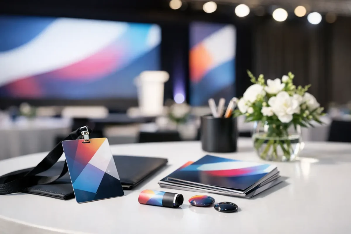
A delegate’s first impression of an event may be a registration email, a name badge, or a directional sign outside a ballroom. Event branding and collateral design therefore cannot be treated as decoration added at the end of planning. It is the practical expression of what the event promises: a considered experience, a confident host and a programme worth attending.
For corporate events, every physical and digital touchpoint carries weight. A conference needs momentum, clarity and must convey credibility while helping busy delegates find the right sessions. An exhibition stand has only moments to communicate relevance in a crowded hall. In each case, the design must work hard as part of the event operation, not simply look attractive in a presentation.
What event branding and collateral design must achieve
Strong event design creates recognition, but its greater value lies in making an experience easier to navigate and more consistent to remember. It connects the business objective, audience needs and event environment through a clear visual system.
That system may begin with a campaign identity and extend to invitation emails, presentation templates, stage backdrops, digital screens, registration materials, menus, wayfinding, exhibition graphics and post-event communications. These are different formats with different production requirements, yet they should feel like parts of the same event.
Consistency does not mean applying a logo to every surface. It means making deliberate choices about colour, typography, imagery, language and layout so that delegates can understand where they are, what matters and what to do next. When the programme changes venue, city or country, that visual discipline becomes even more valuable.
For organisations hosting programmes across Singapore and Asia-Pacific, collateral must also account for local conditions. Venue dimensions, display specifications, freight lead times, language needs and print availability can vary significantly. A concept that works on a screen may be difficult to install at scale, while a visually ambitious piece may not be the most responsible use of budget if it does little to improve the attendee experience.
Begin with the event’s business purpose
The most successful creative briefs start before visual exploration. They clarify what the event needs to achieve and who needs to leave with a changed perception, stronger relationship or clear next step.
A leadership conference may require a restrained identity that gives senior speakers authority and makes complex content easier to absorb. A customer forum may need warmer, more conversational design that supports discussion and hospitality. For an incentive programme, the balance may shift towards a stronger sense of place and occasion. There is no universal design formula because the audience, setting and desired outcome are different.
This early conversation should establish the non-negotiables: corporate brand requirements, decision-making milestones, event format, attendee profile, venue constraints and available production timeline. It should also identify the moments that matter most. For some programmes, that may be the opening plenary and executive welcome. For others, it is the exhibition floor, a networking dinner or a product demonstration area.
With this foundation, the creative direction has a job to do. It is no longer a collection of attractive references. It becomes a tool for supporting the event strategy.
Design for the full attendee journey
Delegates do not experience event branding in one view. They encounter it in stages, often while managing travel, meetings and a full agenda. The visual journey should anticipate this reality.
Before arrival, event communications should make registration, travel details and programme expectations straightforward. At the venue, signage and registration touchpoints should reduce uncertainty. During the event, stage graphics, session templates and environmental branding should reinforce the central message without competing with speakers or content. Afterwards, the same identity can give follow-up materials a familiar, professional framework.
The right approach depends on the programme. A one-day workshop may need only a focused set of assets. A multi-day conference tour requires a more detailed toolkit that remains consistent across locations while allowing for venue-specific adaptation. Designing every item at the outset can create waste; designing too little can leave onsite teams improvising under pressure. The answer is a proportionate system, planned with the real event journey in view.
Collateral must be practical before it is impressive
A beautiful badge that is hard to read from a conversational distance has failed its basic purpose. A wayfinding sign placed too high, too low or too late can frustrate delegates even if it is perfectly on brand. Good collateral design respects how people move, queue, meet and make decisions in real spaces.
Legibility is especially important in large conferences and exhibitions. Type sizes, contrast, viewing distance, lighting and installation position all affect whether information can be used quickly. Directional signage should prioritise the next decision rather than load every sign with every detail. Session-room identifiers should be visible from natural approach points. Registration counters need a hierarchy that helps attendees, hosts and onsite teams identify the correct queue without repeated explanation.
Material choices carry practical implications too. Fabric backdrops, modular structures, foamboard, vinyl, digital displays and printed materials each offer different advantages in finish, installation, transport and reuse. A premium result does not always require the most elaborate material. Often, it comes from accurate production artwork, disciplined specifications and close coordination with the venue and production team.
Sustainability also deserves practical consideration. Reducing single-use printed items, selecting reusable components and consolidating information in digital formats can be sensible choices. However, digital should not be adopted simply for appearance. Where connectivity is unreliable or an audience needs immediate information, a well-designed printed piece remains useful. The aim is to make considered decisions, not to follow a fixed rule.
Build a system that protects consistency
Corporate events usually involve multiple stakeholders: marketing, communications, sales, senior leadership, venue teams, exhibitors and external speakers. Without a clear design system, each new request can introduce a different interpretation of the event identity.
A concise set of event design guidelines helps keep the programme coherent. It can define approved logo use, primary and supporting colours, type hierarchy, image treatment, tone of voice and common layouts for presentations, digital screens and printed collateral. It should be detailed enough to guide production, but flexible enough to accommodate real-world requirements such as last-minute agenda updates or a changed screen ratio.
Templates are particularly valuable for speaker presentations. They give contributors a useful framework while protecting key elements such as title slides, section dividers and closing calls to action. Yet templates should not become a constraint that makes every session feel identical. The strongest systems create a recognisable event frame and leave room for content to do its work.
This is where close collaboration matters. Design decisions should be reviewed alongside run sheets, floorplans, AV specifications and venue walkthroughs. A backdrop may look correct in artwork but need adjustment once stage sightlines, camera framing and screen placement are confirmed. When design and operations are managed in isolation, small omissions can become visible onsite.
Plan for change without losing control
Late changes are part of corporate event delivery. A new speaker is confirmed, a room capacity changes, a sponsor receives additional visibility or a weather plan affects an outdoor activation. The question is not whether change will happen, but whether the collateral plan can absorb it responsibly.
A structured approval process helps. Prioritise high-impact items with longer production lead times, keep editable source files organised, confirm final content owners and build realistic cut-off points for print and installation. For programmes across several destinations, allow additional contingency for local production, customs requirements and replacement options.
There is a trade-off between flexibility and polish. Holding every artwork until the final moment may preserve options, but it can limit material availability and increase production risk. Freezing everything too early may create unnecessary reprints. An experienced event partner helps clients decide which assets need firm early approval and which can remain adaptable.
Measure the experience, not just the appearance
Design success is not limited to whether a backdrop photographs well. It can be measured through practical signals: smoother registration, fewer wayfinding questions, stronger attendance at priority sessions, confident speaker delivery and positive feedback on the event environment.
Post-event feedback is useful when it asks specific questions. Did delegates find the venue easy to navigate? Were session materials clear? Did the event feel consistent with the organisation’s brand and purpose? These insights can improve the next programme and help distinguish preferences from genuine operational issues.
For iCube Events, the most valuable outcome is a design approach that gives clients confidence from first brief to final onsite check. The detail may be a table-top sign, an executive presentation or a full conference environment, but each element should serve the wider experience.
When planning the next corporate event, begin by asking what delegates need to understand, feel and do at each stage. That question will lead to collateral that is not only memorable, but useful when it matters most.