
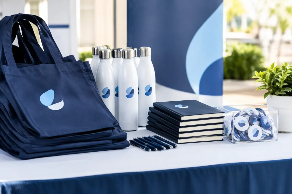
A delegate’s first impression often forms before the opening speaker takes the stage. The invitation, arrival signage, registration desk and presentation screen all signal whether an event has been thoughtfully planned. The top event branding materials do more than display a logo: they help people find their way, understand the occasion and feel confident they are in the right place.
For corporate conferences, customer forums, incentive programmes and exhibitions, that distinction matters. Brand materials need to work hard across practical and reputational requirements, particularly when stakeholders, senior leaders and regional delegates are in the room. The strongest choices are not necessarily the most numerous. They are the ones that connect the event’s business purpose to a consistent delegate experience.
Start with the attendee journey, not the merchandise
A branded item is only valuable when it supports a real moment in the event journey. Before selecting formats, map what delegates need from the point they receive their first communication through to their departure. A regional sales meeting may require clear airport-to-hotel instructions, directional signs for breakouts and branded presentation templates. An exhibition may place greater emphasis on stand visibility, product messaging and lead-capture touchpoints.
This approach prevents a common problem: producing attractive collateral that has no useful role on site. It also helps teams distinguish between essential materials and optional enhancements when timings or budgets are under pressure.
Consider the questions delegates will have at each stage. Where do I go? What is happening now? Who can help me? What should I remember after this session? Each answer can inform a material choice, from wayfinding panels to agenda cards, digital screens and post-event follow-up assets.
Top event branding materials for corporate programmes
The right mix depends on event format, venue conditions, audience profile and the level of interaction required. However, a well-considered corporate event normally gives priority to four connected areas:
- Arrival and wayfinding materials, including venue entrance signs, registration backdrops, directional signage, lift decals and room identifiers.
- Registration and hospitality touchpoints, such as welcome desks, name badges, lanyards, table signs, menu cards and VIP itineraries.
- Content-stage branding, including screen graphics, lectern panels, speaker slides, session holding screens and on-stage set elements.
- Takeaway and follow-up materials, from event guides and curated gifts to digital resource packs and branded post-event communications.
These categories should feel like parts of one system rather than separate design exercises. A delegate who sees one visual language at registration, another in the plenary room and a third on event communications may not articulate the issue, but they will notice a lack of care.
Wayfinding is a brand experience
Wayfinding is sometimes treated as purely functional, then left until the final production schedule. In reality, it is among the most visible expressions of event quality. Confusing routes create queues, late arrivals and unnecessary pressure on the on-site team. Clear, well-positioned signs keep the programme moving and make a large venue feel manageable.
For multi-track conferences, use a simple hierarchy: event identity first, location second, session detail third. Delegates should be able to scan a sign quickly while walking. Avoid small type, dense copy and colour combinations that become difficult to read under venue lighting.
Cross-border programmes need further consideration. Language requirements, local venue conventions and airport or hotel layouts can alter how information is presented. Materials must be adapted without losing the core event identity. This is where early coordination between creative, logistics and on-site teams pays off.
Registration materials set the tone
The registration area is where event planning becomes tangible. It is also where small operational details have an outsized effect. A badge that is difficult to read, an unclear queue system or a desk lacking visible information can undermine an otherwise polished programme.
Name badges should prioritise legibility at conversational distance. Include the attendee name prominently, then role and organisation where appropriate. Colour coding may help distinguish speakers, sponsors, media, staff or different delegate groups, but too many colours can become confusing. Lanyards should be selected with comfort, security and the venue’s access requirements in mind, not just appearance.
For hosted dinners, leadership meetings or incentive groups, personalised welcome cards and itineraries can add warmth without becoming excessive. They signal that delegates have been anticipated as individuals. This is particularly effective when hospitality is central to the event objective.
Build a design system that survives real event conditions
Event branding is often reviewed on a screen, under ideal conditions. It must also perform in a ballroom with low lighting, in a busy exhibition hall, on a mobile device and in a photograph shared after the event. A flexible design system protects quality across those settings.
Set practical rules for logo placement, type sizes, approved colours, image treatment and calls to action. Create templates for presentation slides, digital screens, printed signs and event communications. This gives multiple production partners and internal stakeholders a shared reference point, reducing last-minute inconsistencies.
However, consistency should not mean repetition. The main stage can carry the strongest visual statement, while directional signage should remain restrained and clear. A customer dinner may call for refined table details rather than large-format graphics. An exhibition stand needs bolder sightlines from a distance. The brand should be recognisable, but each application must suit its job.
Material selection deserves the same discipline. Fabric backdrops can create a premium finish and travel efficiently, while rigid panels may suit locations needing crisp, freestanding structures. Digital displays allow fast programme updates but depend on reliable power, content management and technical support. Printed materials can offer useful tactility, although changes close to the event may result in waste. There is no universal best option – the operational context decides.
Let the event purpose shape the message
A visual identity cannot compensate for unclear messaging. Before briefs go to design or production, agree the central thought delegates should take away. Is the event recognising performance, building customer confidence, introducing a product direction or bringing dispersed teams together? That purpose should inform the language on screens, signs and delegate materials.
A leadership summit may use concise statements around direction and alignment. A life-sciences meeting may need a more measured approach, with carefully governed content and clear educational framing. A technology conference can accommodate more dynamic demonstrations and interactive screen content, provided the key message is still visible amid the activity.
Keep copy short where people are moving. A registration backdrop is not a brochure. Use it to establish event identity and create a strong photographic setting. Save detailed explanations for programmes, session materials or digital channels where delegates have time to engage.
Plan production early and allow for change
The most ambitious materials are only effective if they arrive, install and perform as intended. Production planning should begin alongside venue and programme decisions, not after the creative concept is approved. Confirm venue restrictions, loading access, rigging rules, power points, fire-safety requirements, installation windows and storage arrangements before finalising formats.
For events across Asia-Pacific, lead times and local sourcing options can differ significantly. A material available in Singapore may not be suitable for an overseas venue, while customs arrangements may make transporting items less practical than producing locally. The best solution balances brand consistency with dependable delivery on the ground.
Build in a review point for late programme changes. Speaker substitutions, room moves and revised attendance numbers happen. Editable digital content, modular sign structures and carefully managed print deadlines give teams more room to respond without compromising the delegate experience.
At iCube Events, this coordination is treated as part of the wider event plan, bringing design, operational requirements and client priorities into the same working conversation. It helps ensure that what is approved on paper is practical to deliver at the venue.
Measure what people actually notice
After the event, assess branding materials through more than photographs. Ask whether delegates found the venue easy to navigate, whether registration flowed smoothly and whether the event identity supported the intended message. On-site observations are valuable too: recurring questions at help desks, congestion near signs and unused printed guides all reveal where improvements are needed.
For exhibitions and customer events, consider interaction quality alongside visibility. Did attendees understand the proposition quickly? Did branded spaces invite productive conversations? Were delegates taking away the materials intended for follow-up? These signals give future programmes a more useful basis for decision-making than simply reusing the previous event’s asset list.
Thoughtful branding does not need to compete for attention at every turn. Give delegates clear cues, credible detail and a visual environment that supports the conversations the event was created to make possible.